Amazon App Redesign
by Taylor Han & Lisa Eun
Scope: Project Management, User Research, UI/UX, Testing
Role: UX Research, UI Design, Lo-fi Sketch
Timeline: 3 months (October - December 2020)
Background
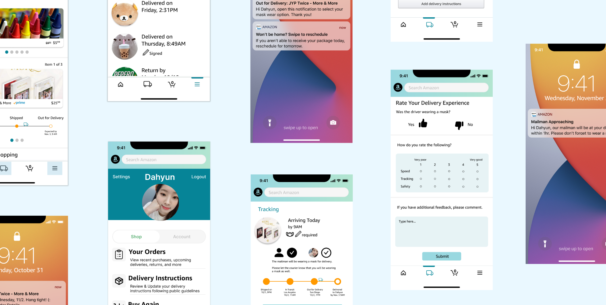
Today, Amazon is one of the most influential tech giants that leads E-commerce. With E-commerce businesses such as Amazon and eBay seeing an unprecedented rise of online sales, the safety of the mailmen and customers residing in their homes must not be overlooked. Consequently, we chose to extend and design the iOS Amazon mobile application to implement COVID-19 guidelines, in addition to improving the tracking experience. While most package deliveries do not require customers’ signature, some of the more valued items require that the resident signs for the package at the time of delivery. With our UI extension to the app, safer and efficient delivery can be provided and help prevent the unnecessary spread of COVID-19.
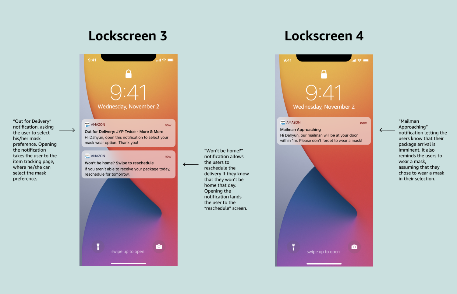
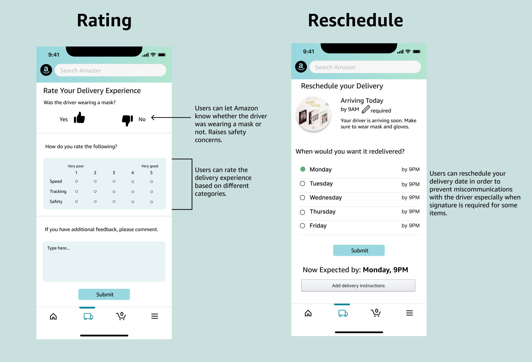
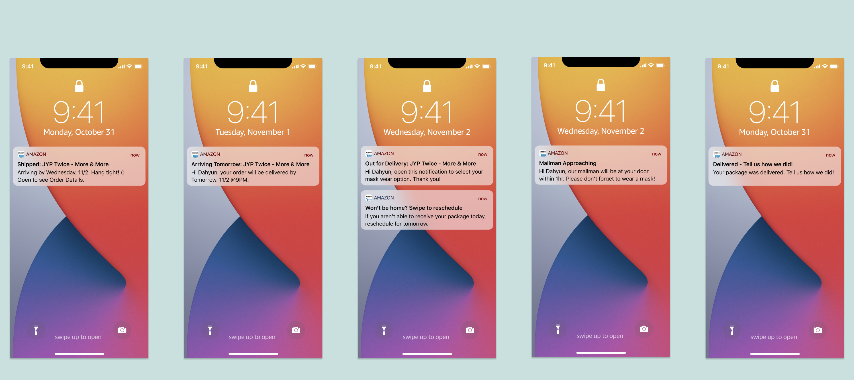
Although the Amazon mobile app has the option to specify delivery instructions for both no-signature and signature-required packages, it is not as clear and prominent as it should be. We felt that in the time when keeping social distance and minimizing contacts are crucial, the current iteration of the Amazon application is not as enforcing enough. This is especially more relevant for packages that require signature--the application only lets the customers know that their signature is required and doesn’t ask for more information. With our implementation, for any package delivery that requires the customer to meet the mailman and/or to sign the package, the user will receive a notification to acknowledge that they are home and will wear a mask. Letting the mailman know this information ensures that the package can be delivered. If the user won’t be home, it can save the mailman’s time by attempting to deliver the user-chosen redelivery day.
Problem Statement
“I feel like [Amazon] gives very general estimates. I only know that they are out for delivery and it will arrive by 8pm by that day” -C.E.
“While Amazon is most of the time on track with their package delivery, there were some cases of packages being delivered late or lost. I also want better transparency from the tracking side, such as the “out for delivery” stage. I want to know where my package is and how early it will be delivered.” - N.O.
Research Methods
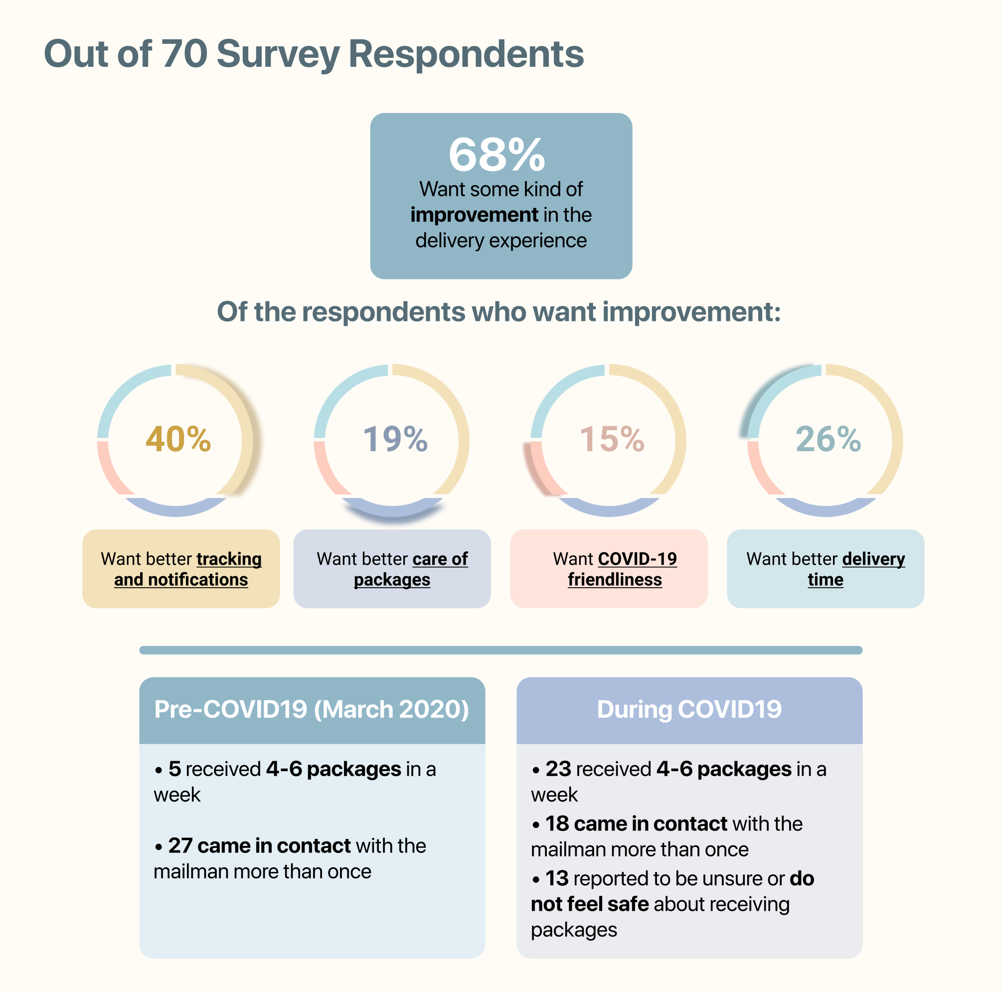
In order to determine the key pain points of Amazon’s delivery services, we decided to implement mixed-methods to gather a variety of responses and opinions about the app. We believe that getting quantitative data from surveys will give us helpful statistics of how users interact with the app and their general opinions on its features. However, quantitative data alone does not allow us to learn about users’ personal experiences. So, we conducted interviews for qualitative information as users are able to provide detailed explanations of their thoughts and interactions with the Amazon app.
The survey included more general questions such as asking the user’s overall experience with the app, what features they like/dislike, and how they feel about Amazon’s delivery services. We also asked general questions not limited to Amazon services such as “What is your current experience with delivery” and “What are some things you would change in your current delivery experience.” Through the survey we hoped to learn about each user’s experience with purchasing and receiving packages, and potential concerns of how packages are being delivered.
Research Findings
User Personas
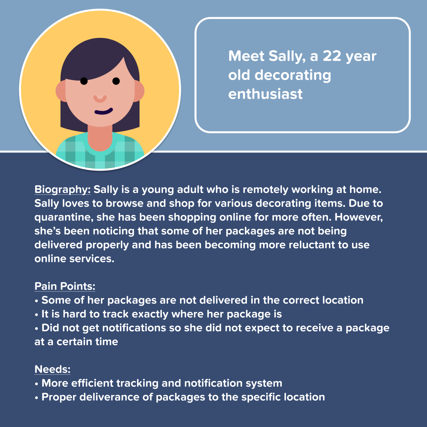
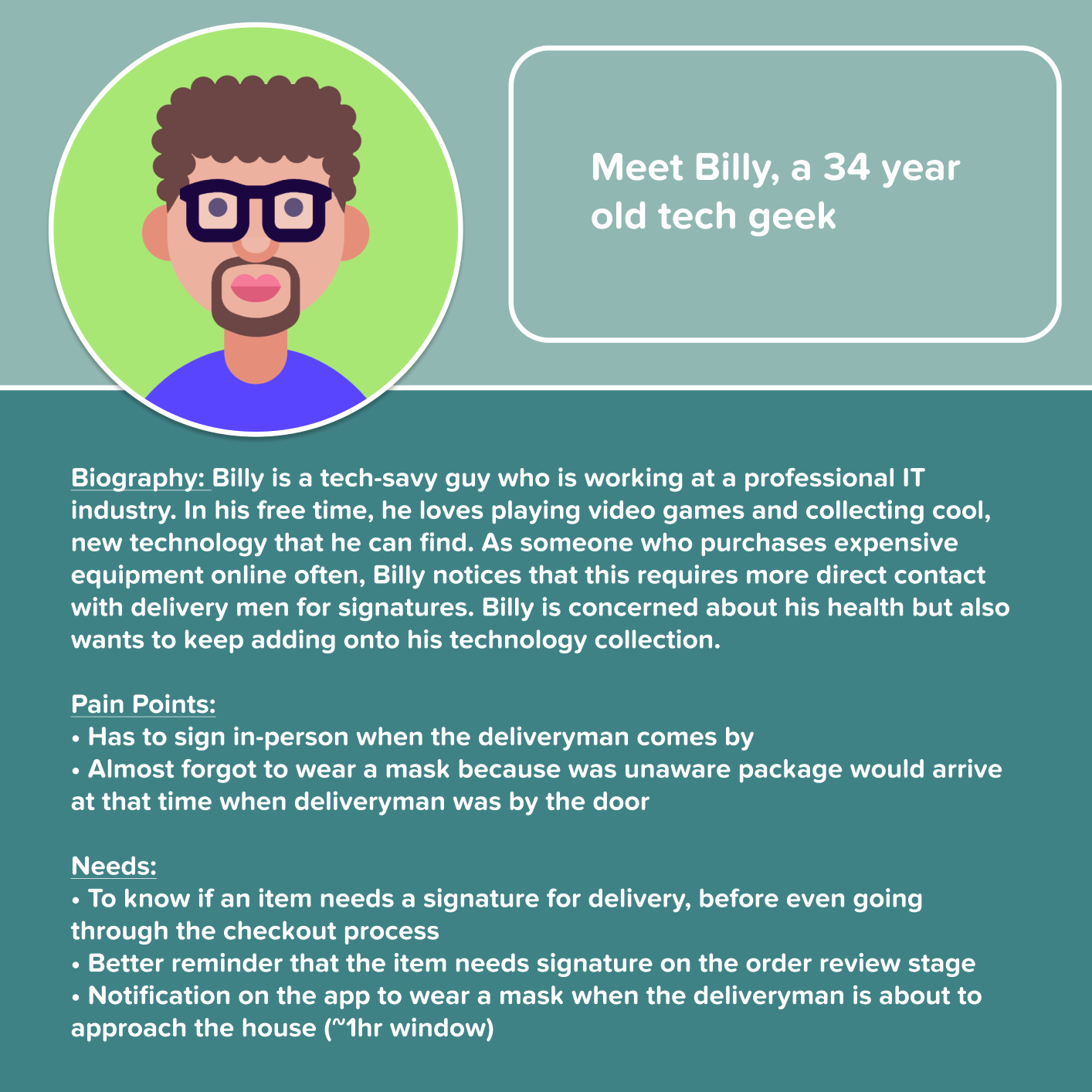
Based on our research, we created 2 user personas to summarize our users' pain points and needs.
Competitive Audit
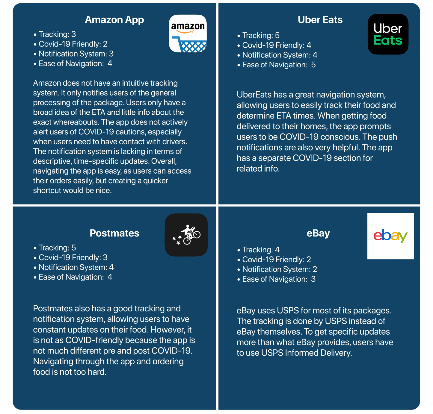
From there, we took a careful look at the shortcomings and strenghts of Amazon's competitors and other delivery services. The summary of competitive audit is shown below.
Note: 1-5 scale was used. A 1 indicates poor quality and a 5 indicates good quality.
Design Iterations
Pencil & Paper
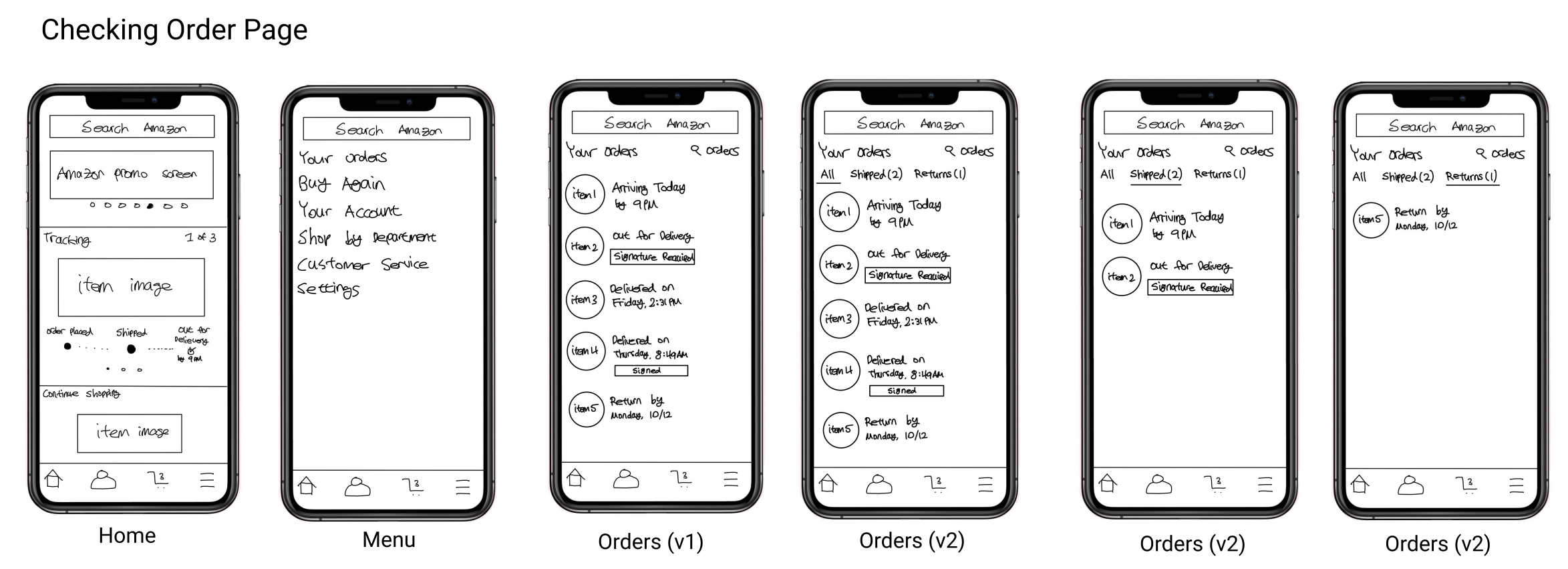
We first created a low fidelity pencil & paper sketches to visualize how we wanted to tackle the design challenges that were presented to us. Instead of honing down on one version, we made two different versions of each redesign so that we keep our options open. These gave us a good glimpse and blueprint of how we wanted our final design to look.
Low Fidelity Prototypes
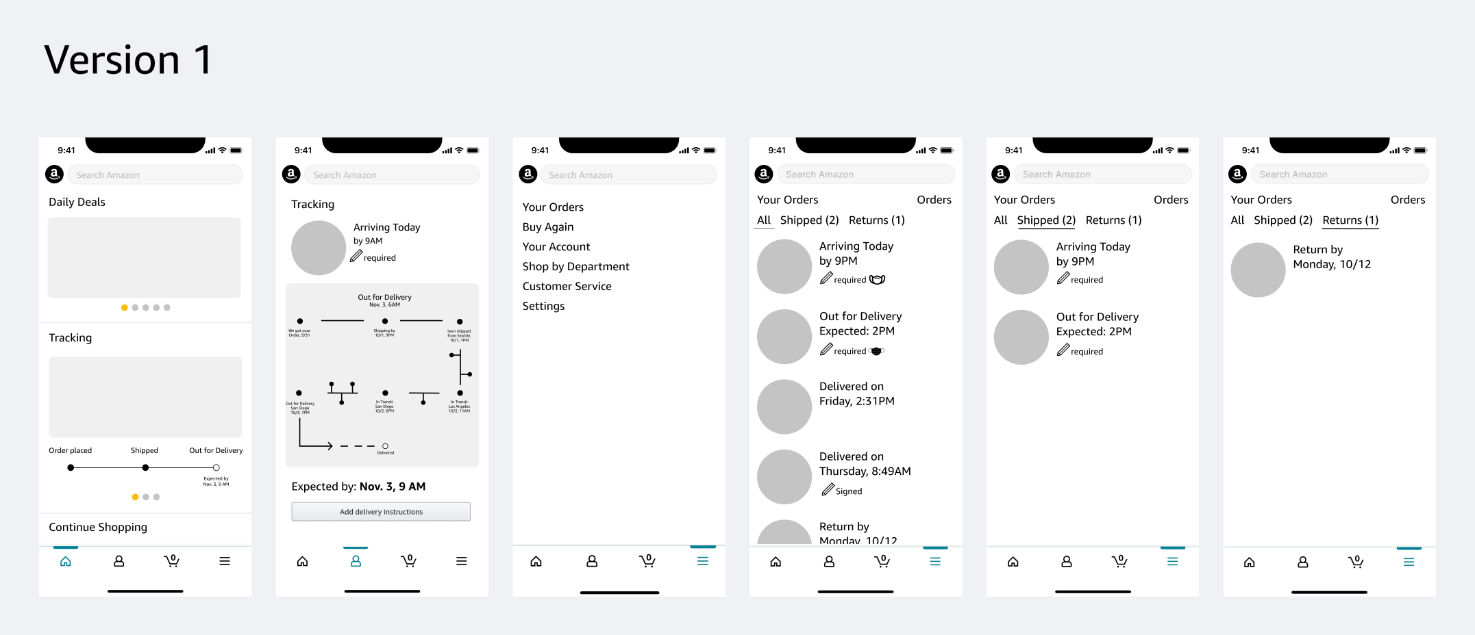
The next step was to create low fidelity Figma designs, which we user tested and received a handful of critical feedbacks. The two versions are shown below.

User Testing
We then proceeded to user testing these low fidelity prototypes. We asked 4 interviewees what they liked and disliked from each version.
The user testings were really helpful in sorting out which features worked the best and what did not. We were not sure how to approach the tracking system and made two very different designs. We were glad we did the testing because it definitely gave us insight into which version one plays a better solution to users’ needs. Based on the user testings, we noticed that all 4 users preferred the version 1 tracking system, though there were comments of its perplexity and new users won't comprehend it properly. With that in mind and as we transitioned to high fidelity prototyping, we kept version 1 tracking, but also created an alternative tracking page for future tesing.
We also noticed that users had a hard time choosing one version over the other, especially because they liked version 1’s tracking but also liked version 2’s improved menu UI. Based on this, we believe that combining certain elements from each version will help create a better interactive user experience.
High Fidelity Prototypes
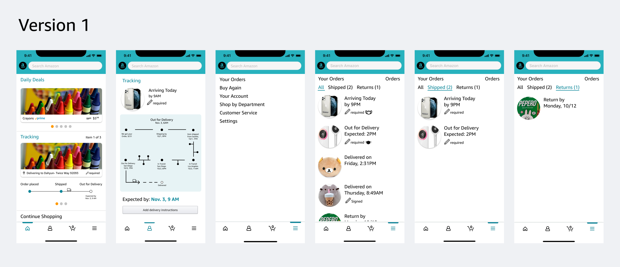

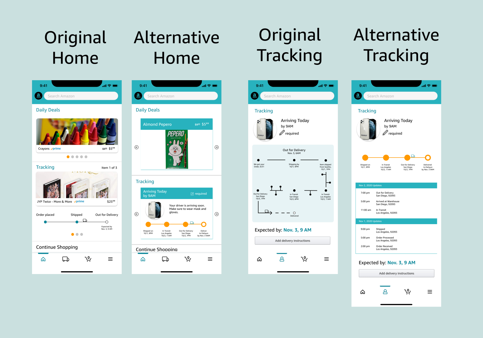
For the tracking interface, we thought having an infographic that displays each module could be overwhelming to the eye. So, for the alternative we tried to make it easier to view the most important stages of the delivery process at the top and have specific details below. For the alternative home screen, we tried to make the tracking elements consistent with the tracking page and also changed the UI style from the original.
Making Final Touches
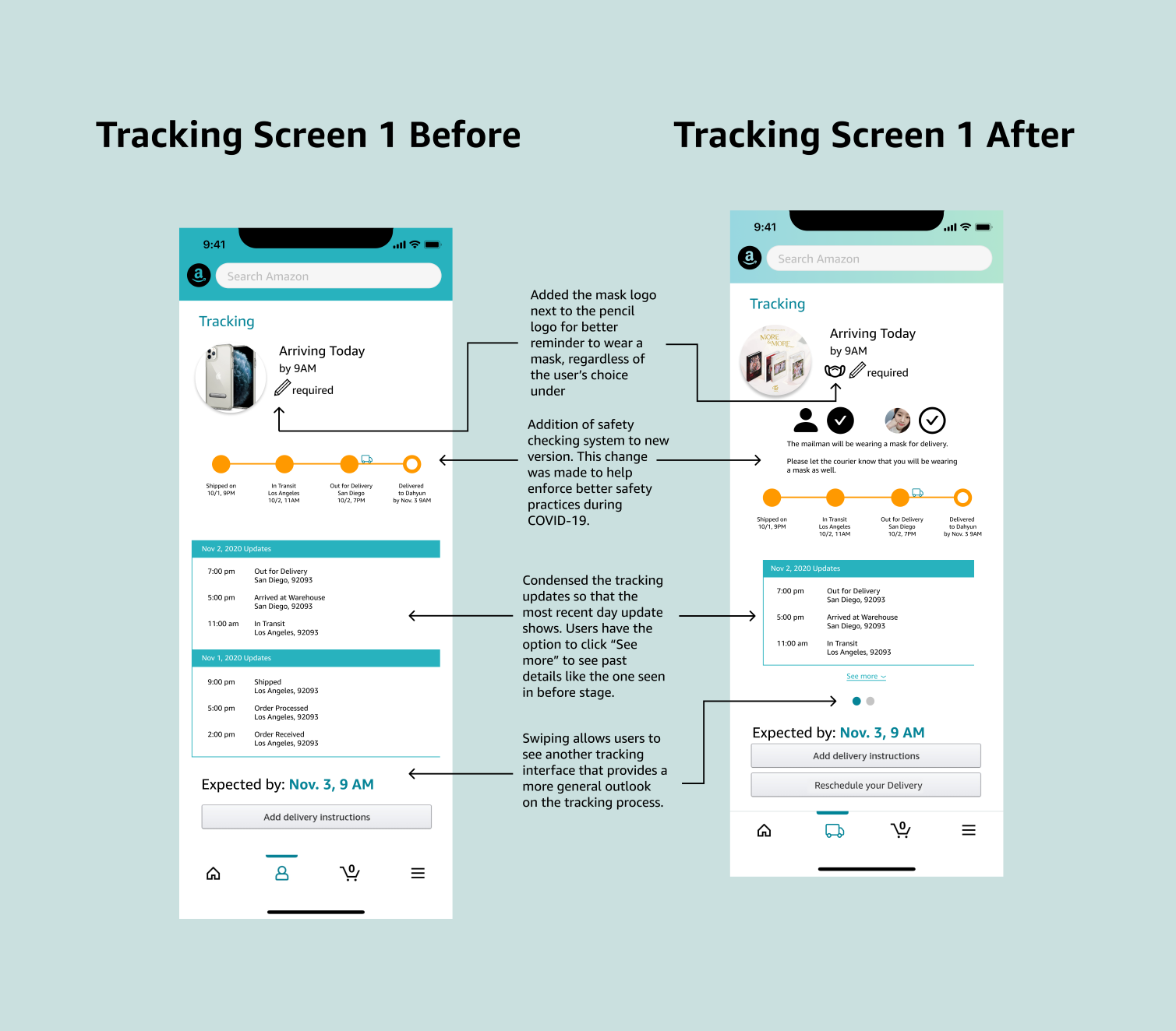
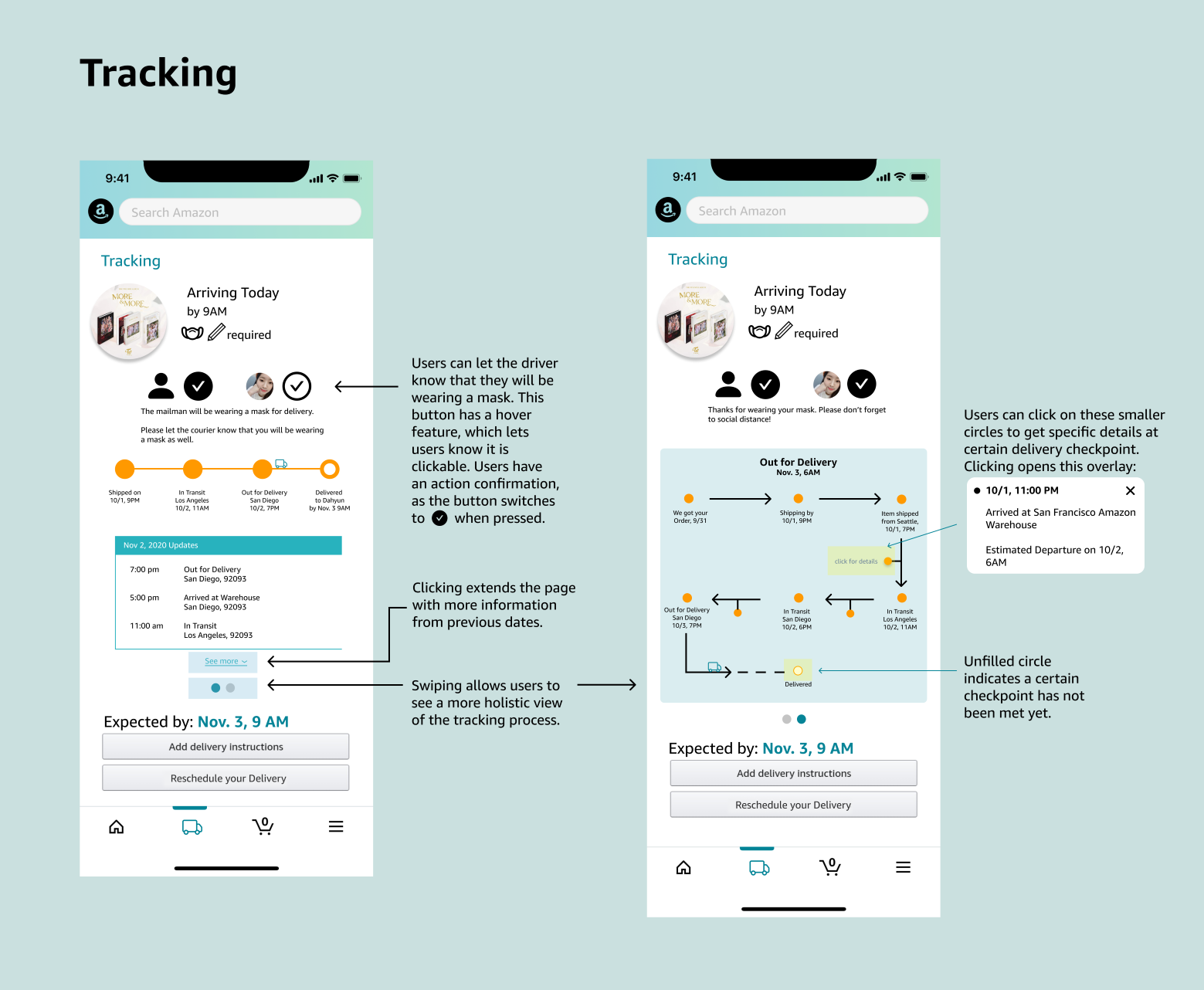
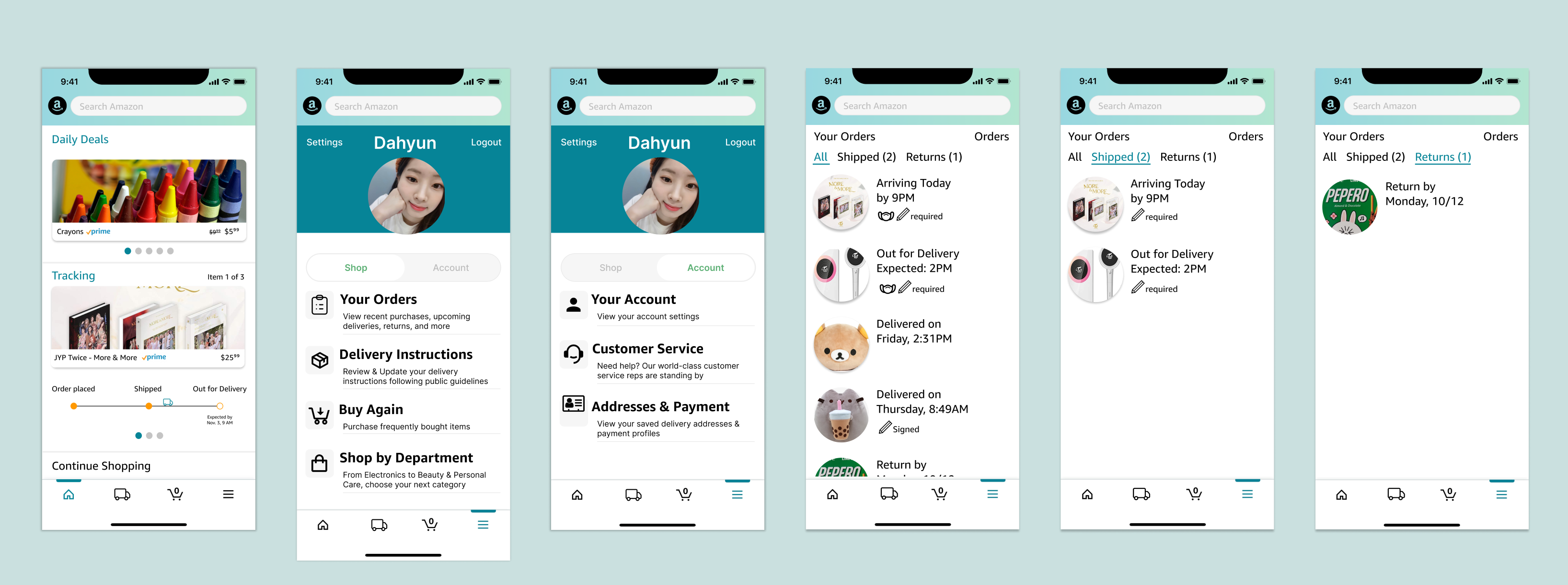
Before we made our final design selection, we went through another round of user testing to experiment with the alternative designs and work out the fine details. Since redesigning the tracking page was one of our main focuses, we decided to combine the original and alternative versions as users liked that idea. Stemming from the problem statement, other additions such as the mask selection area were made.
Final Design Descriptions
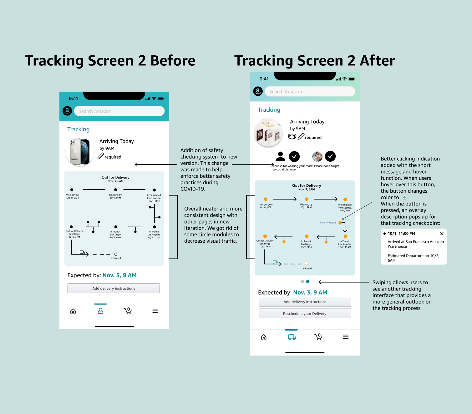
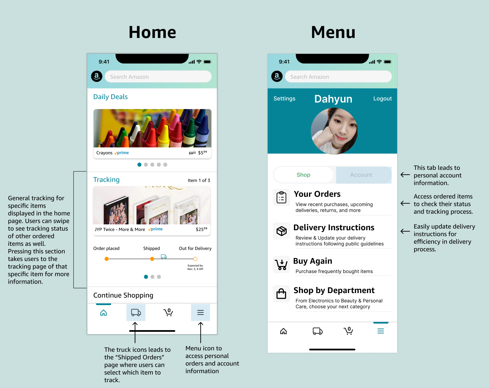
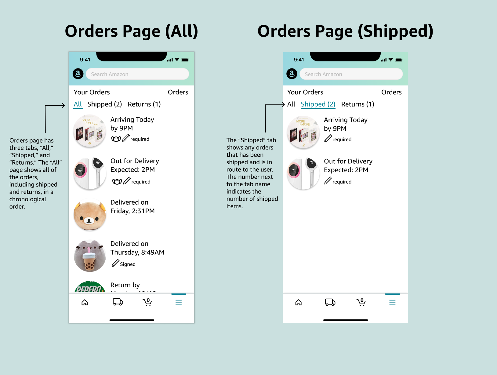
Below are selected final design and each page's description. Per our user testing, we chose to go with the original home design and combine the original and alternative tracking page.
Final Design Gallery
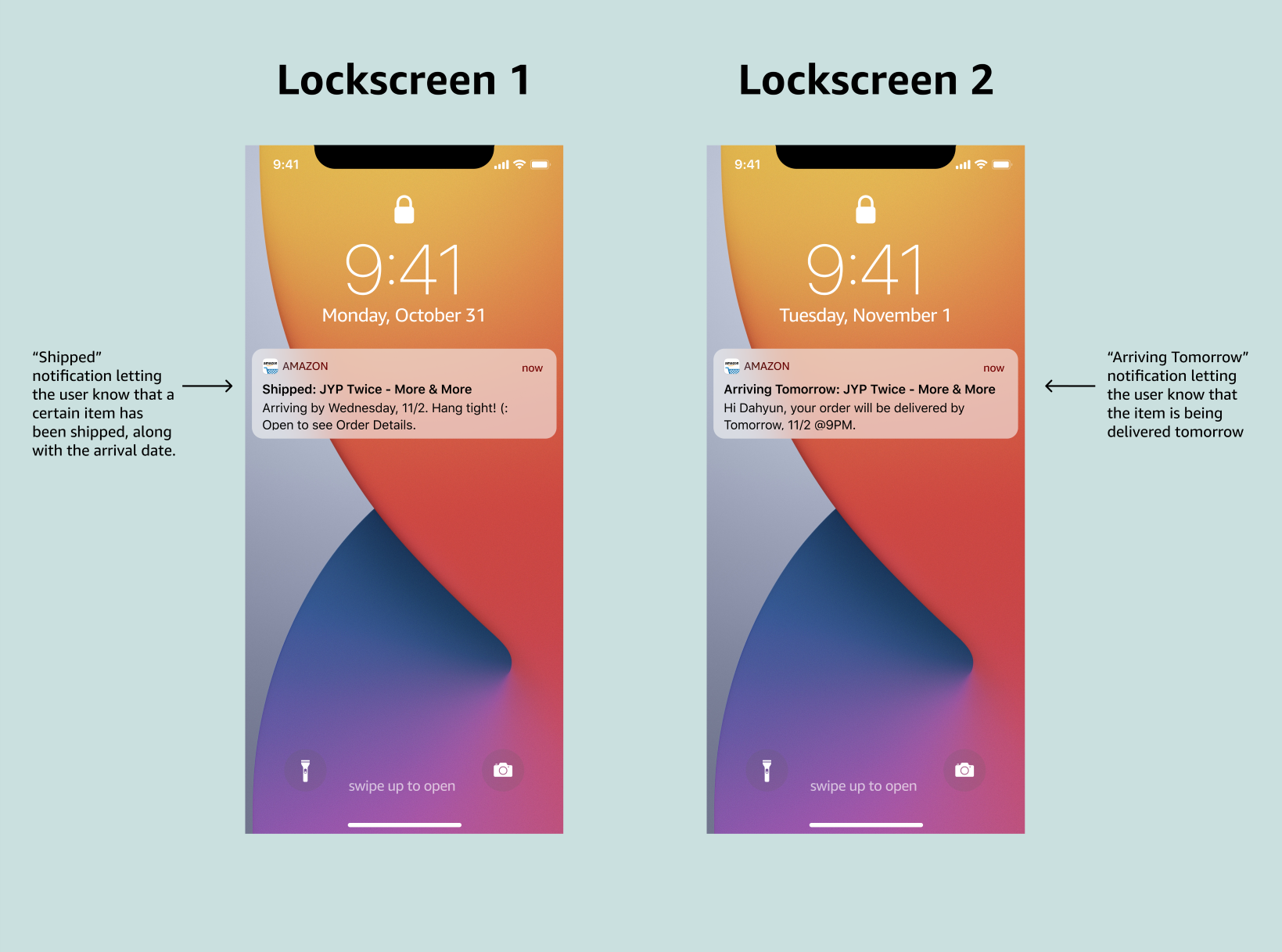
Below are every page that we worked on and selected as final designs.
Closing Remarks
The goal of this design project was to enhance the tracking experience of the Amazon mobile application, in addition to implementing COVID-19 guidelines. We believe that with our redesign, that very goal was met. Through our improved UI and UX, Amazon customers relish more detailed tracking information and safer package delivery experience.
With that being said, we believe that our redesign can be applied beyond the Amazon application. From Postmates to UberEats, implemeting a design that is similar to ours has a high potential to contain the spread of COVID-19, especially in the time when keeping social distance and minimizing contacts are crucial.